Street Graffiti
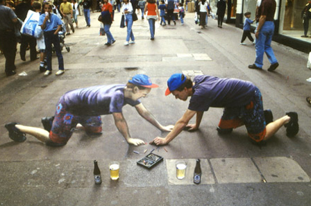
In this picture, there are elements and principles of design that are present. Lines and shapes are used in the artwork to create the person itself. Value is used in the picture to make the artwork look three dimensional. Many colours are used to match the artist of the artwork and to make the artwork not look boring. I really like this picture because I like what the artist did with the art. He made it look like there were two of himself parallel to each other and that they are drawing each other. I also like the three dimensional effect the artist put on it.
Light Graffiti
In this artwork, the elements and principles of design are also present. Space is used to show that the buildings are very close together just like in real life. Lines and shape are used to create the buildings in the artwork. There are few colours that are used in the artwork and they represent the lights of the buildings and the outlines of the buildings. I really like this artwork because it represents the city of Toronto which is where I live and where I am proud to live in. I also like how the background of the picture because it's very dark and the art work is emphasized.
Contrast and Compare
Street graffiti and light graffiti are the same and different in many ways. They are the same because they are both graffiti and a lot of hard work is put into both of these. They are very different from each other. Street graffiti is permanent while light graffiti is not. I think that street graffiti needs more time to create whereas light graffiti can be done in very little time. I also think that street graffiti is harder to do since you cannot re-do anything.


i like your light graffiti picture .. good work
ReplyDeletegraffiti
This comment has been removed by the author.
ReplyDelete