Logo By Greenpeace UK
 1. Describe the logo using the language of the Elements and Principles of Design.
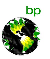
The space between the original logo and the oil spill is there to represent what the Earth looks like right now. The lines in the image are used to show the lands of the Earth and the seas of the Earth as well. The colours that are used are black representing the oil spill, and yellow, green and white which all represent BP's original logo. The only shares that were used are the shapes of the seas and the shapes of the land.
2. Describe the symbols used in the logo. Why did the graphic artist use such imagery?
One symbol that was used in this logo was the sea full of BP oil. This symbol represents what BP has done to our seas and oceans. Instead of them being filled with water, they are filled with 4.9 million barrels of crude oil. The graphic artist used such imagery because in reality, it is true. BP has not done anything to fix the problem and now our oceans are filled with oil. Another symbol that was used in this logo is
3. What does this logo say of BP's coroporate identity?
This logo says that BP does not care about us and our seas. Many animals have suffered and we have suffered as well. It also shows that they cannot control anything. 4.9 million barrels of crude oil was spilled into the ocean and BP could've made that number smaller if they would've done something and controlled the spill.
No comments:
Post a Comment